UX for converting warm leads in AI CRM
+50% conversion rate
About
Averon — an AI-powered CRM system for lead generation and qualification.
In this case study, because the company already had significant brand recognition in the market, most leads arrived at the website from ads, content, and word of mouth as “warm” leads, while the proportion of “cold” leads decreased.
Taking these factors into account, we developed the website structure and messaging, maintaining the company’s visual identity.
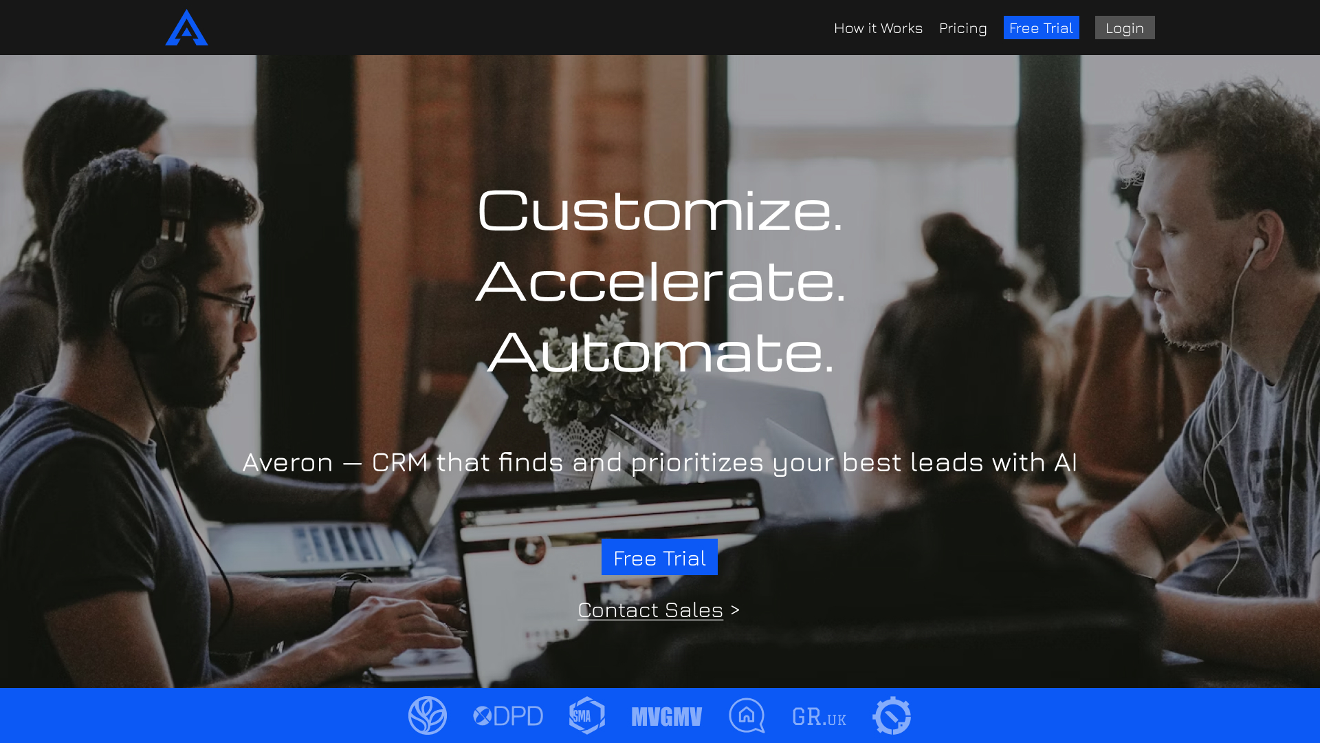
First Screen
The navigation in the header focuses on the key call-to-action, “Free Trial,” which is highlighted in blue.
Secondary elements are styled neutrally so they don’t compete for attention.
This minimizes distractions and guides the user toward conversion.
The headline highlights three key principles "customize, accelerate, automate" to establish a simple and clear framework for the product’s value.
The subheading expands on these, specifying exactly how the CRM solves the user’s problems and eliminating abstractions.
The section featuring logos of leading companies in their industries adds social proof and builds trust right from the first screen.
As a result, the user already has an understanding of the product and a certain level of trust.
The first screen uses two different CTAs to account for the varying levels of readiness among leads.
"Warm" leads can start a free trial right away, when "cooler" leads are directed to the sales team.
This reduces friction and doesn't lose users with different use cases.

Problem
Despite its small size, this section sets the stage for everything that follows.
It resonates with the target audience’s pain points(Significant time spent on processes that can be automated using this software).
As a result, users become engaged more quickly and are more receptive to the next step.
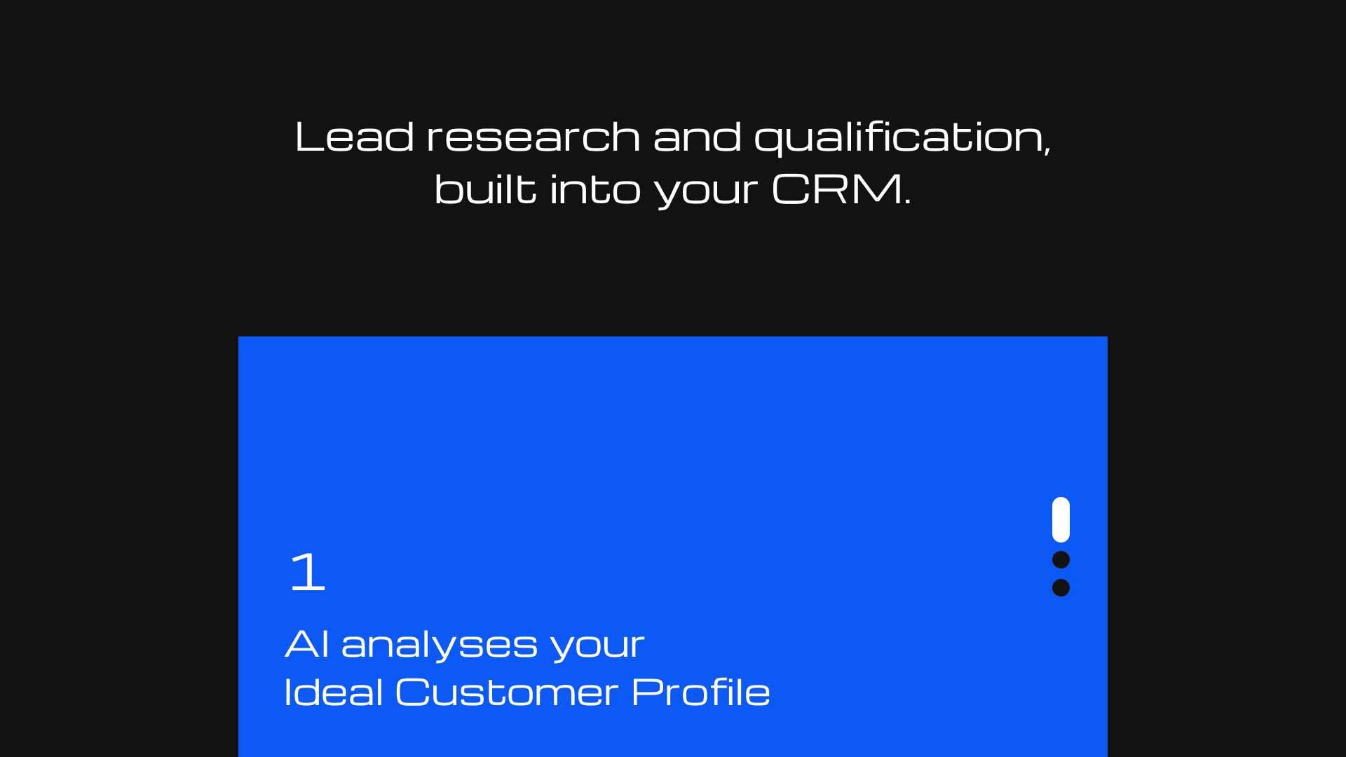
Solution & Clarity
After the problem has been defined, this block moves user to the solution.
The solution block shows exactly how it is addressed at the process level.
Step-by-step logic makes the product's value clear and concrete.
This reduces uncertainty and improves conversion rates.
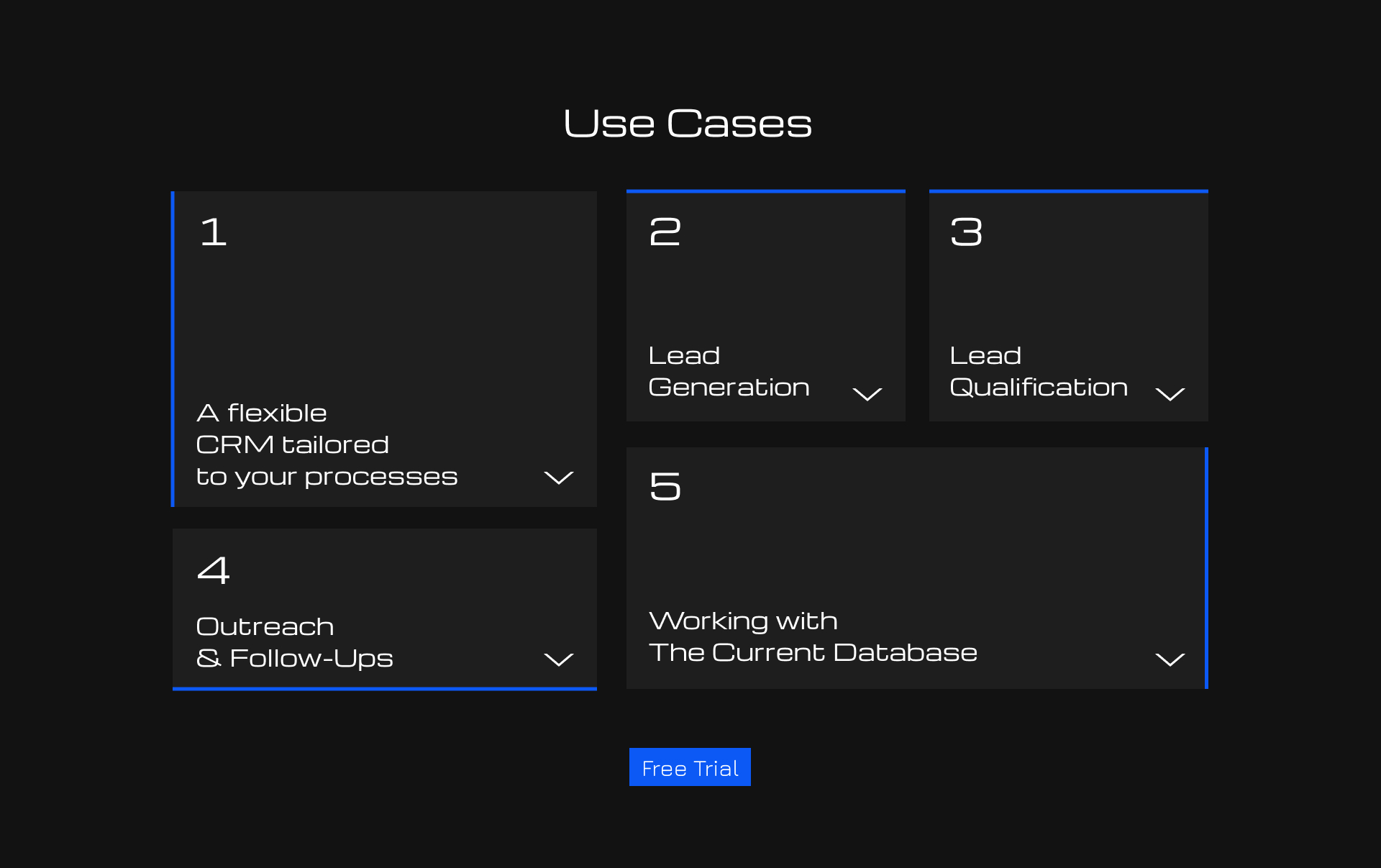
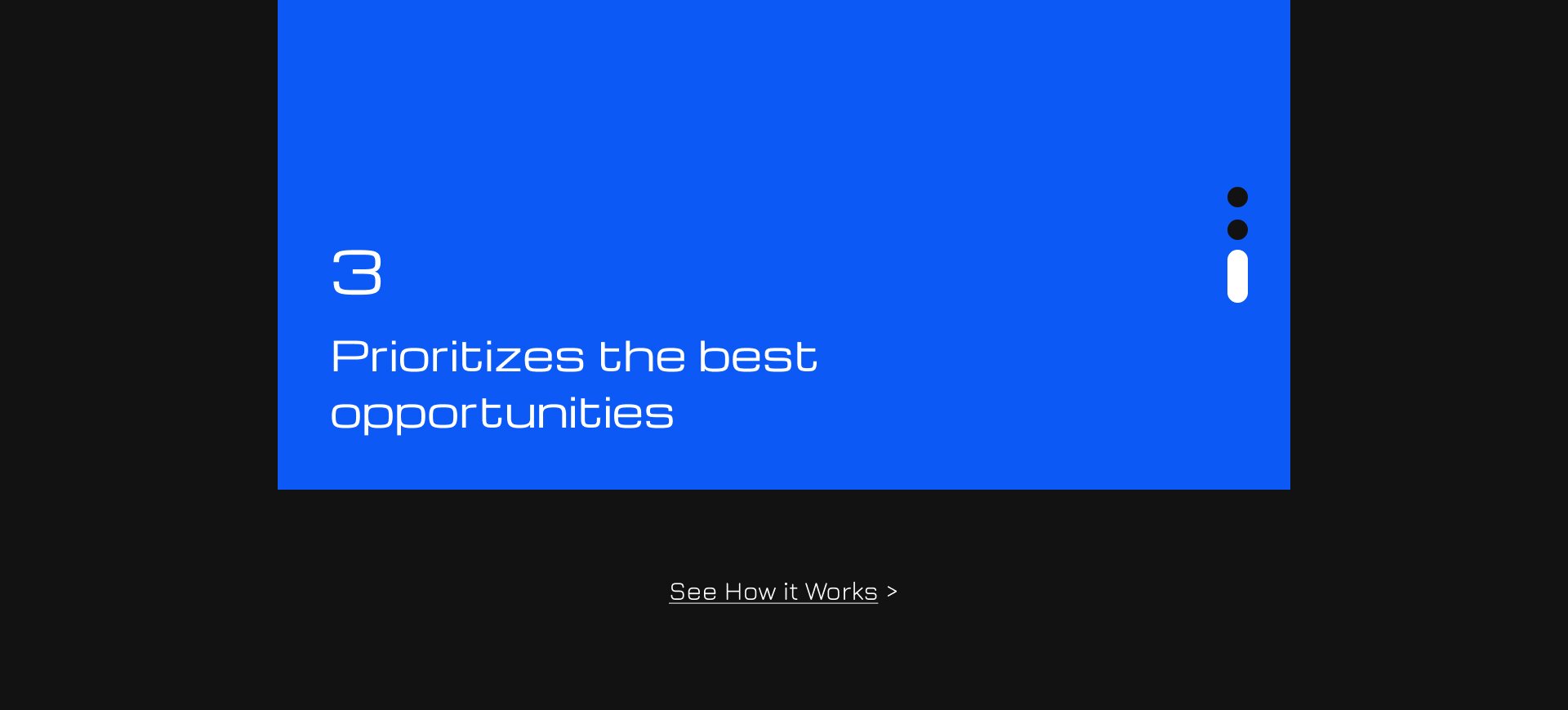
Use Cases
Now that the previous sections have explained how CRM works and what its value is, the use cases bring this down to a practical level.
It helps users quickly understand how the CRM is applied to specific tasks and see how the product fits into their workflow.
Placing a “Free Trial” CTA within this section boosts conversion rates for users who have already recognized the product’s value and see a relevant use case.
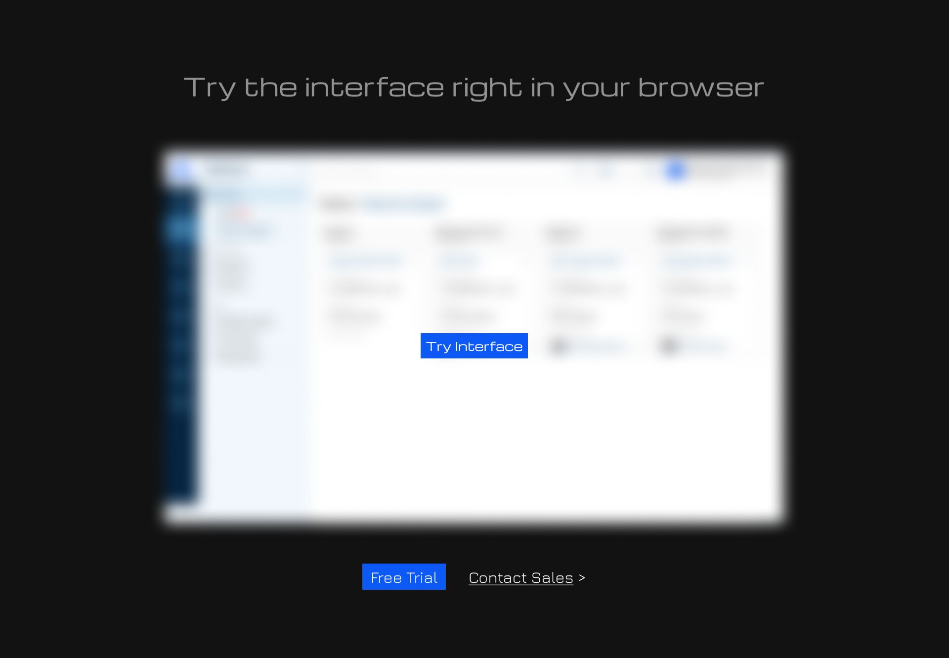
Product
Following the section on use cases, an interactive interface demo allows users to move from scenarios to the product itself.
Instead of an abstract representation, they immediately see how the system works and can independently verify its simplicity and logic.
This reduces skepticism and eliminates the need to “imagine” what the product looks like in reality.

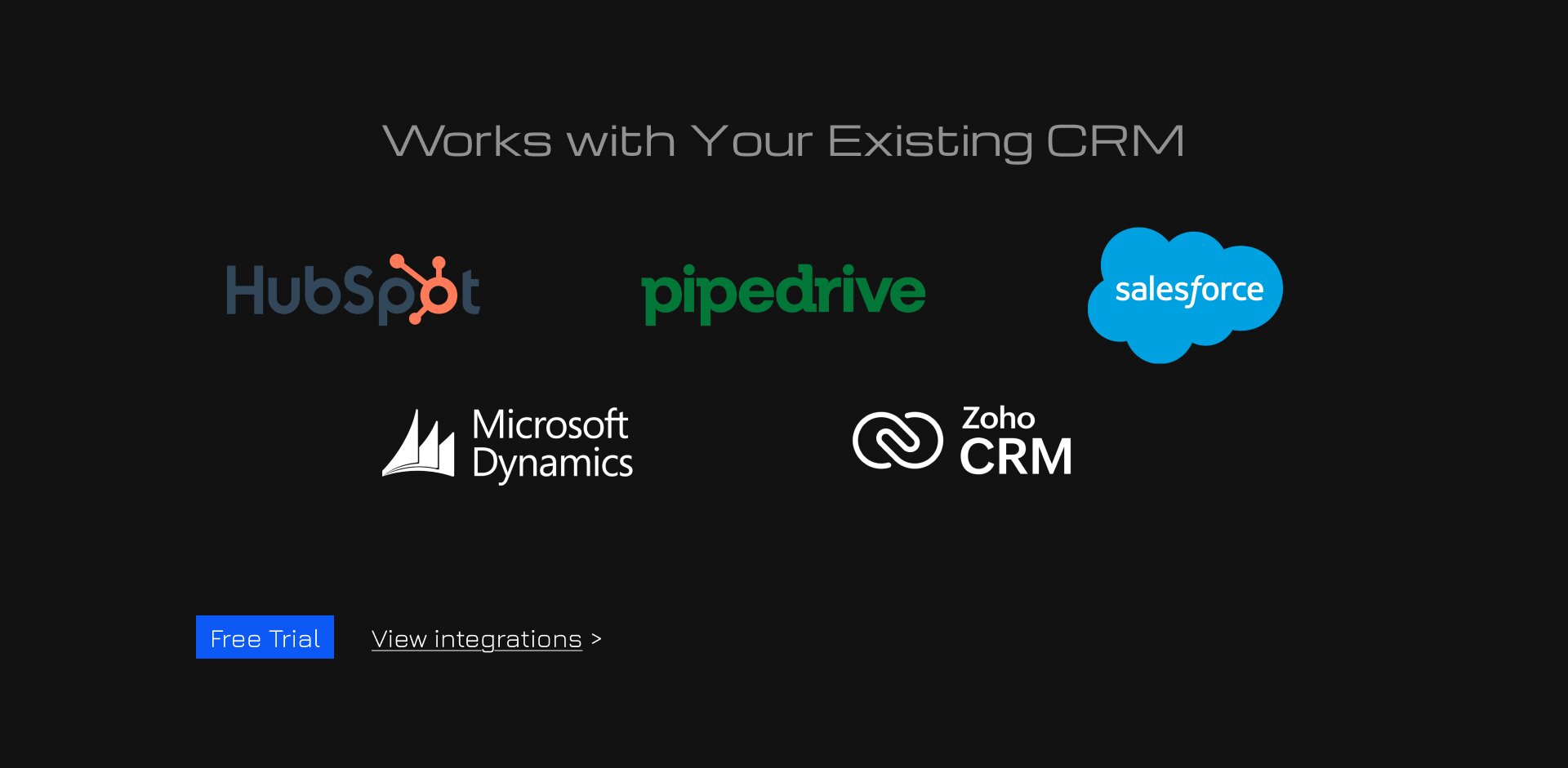
Resolved Concerns
In conjunction with the previous sections, it plays a critical role: after generating interest and conveying value, it addresses any doubts that might deter the user.
This reduces the psychological barrier and increases the likelihood of conversion.
To this end, a system of CTA buttons is also included here, as it addresses some of the users’ most significant concerns.
"Free Trial" for those who have already made up their minds, and “View Integrations” to address any doubts about whether and how their CRM integrates.
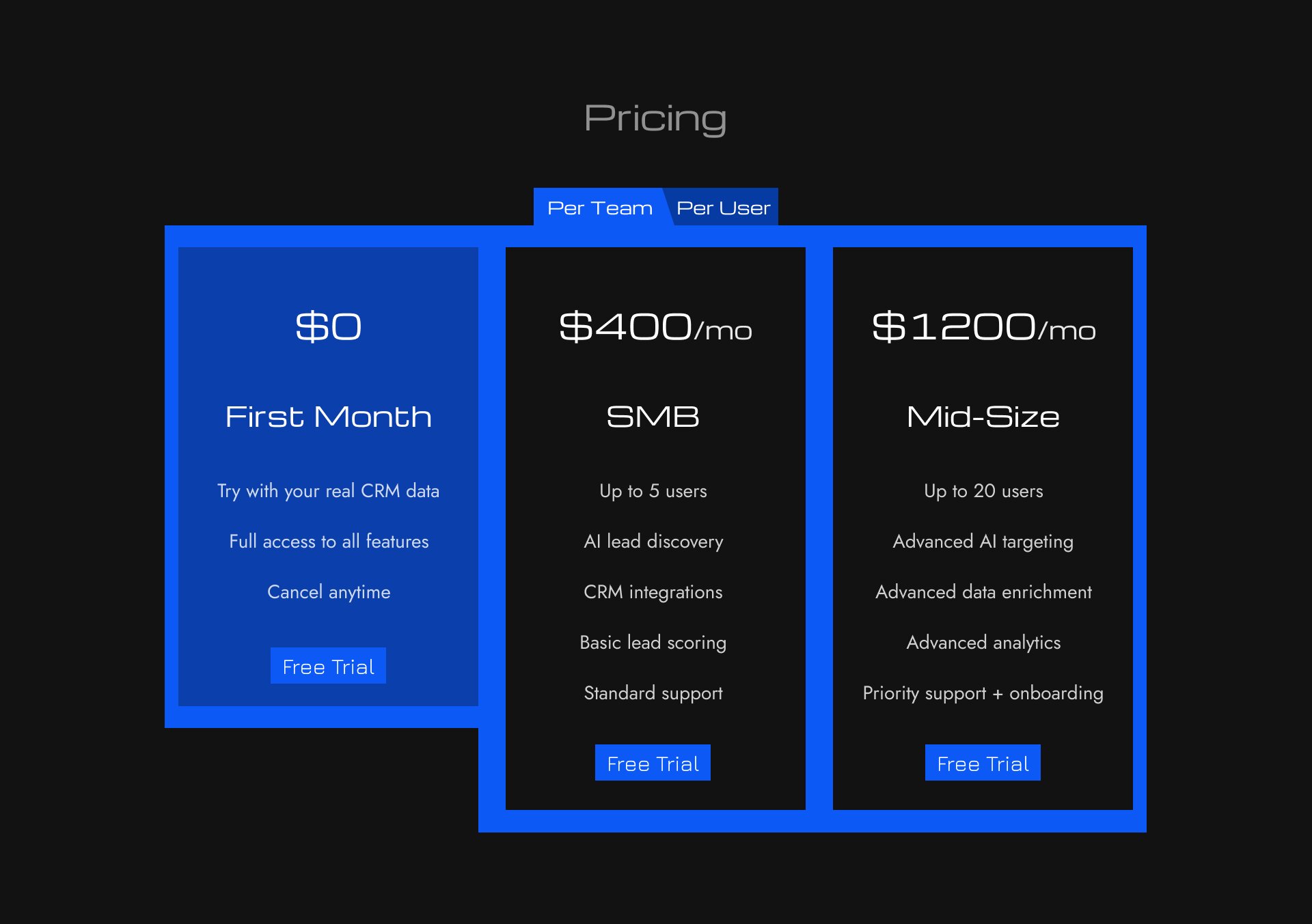

Price & Outcomes
The pricing section continues this approach of lowering barriers by offering a flexible payment model—both per user and per team.
The pricing structure and feature set are designed not merely as a list, but as a reflection of real-world usage scenarios and company growth.
A special emphasis on the first month being free further lowers the barrier to entry, allowing users to get started risk-free and test the product.
The ROI calculation section strengthens the business case for the purchase by addressing the original issue of time wasted on lead management.
It translates the product’s value into numbers, showing how many resources the user is currently wasting and what benefits they could gain.
This increases the pressure on the audience’s pain points and helps them make a decision based not only on their understanding of the product but also on its measurable effectiveness.
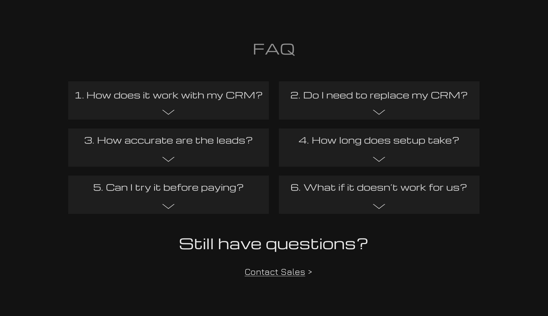
Addressed Fears
The FAQ section addresses any remaining questions or concerns that may arise after browsing the site.
It focuses on the most common concerns of the target audience regarding the product’s usage, implementation, and terms and conditions.
This reduces uncertainty at the final stage and leads more users to conversion.

Final CTA & Footer
Following the FAQ section is the final section, which includes a call to action.
The main narrative of this section also addresses the target audience’s pain points. The entire product and website are built around resolving these pain points, so this section serves as the logical conclusion of the website and the user’s journey toward a solution.
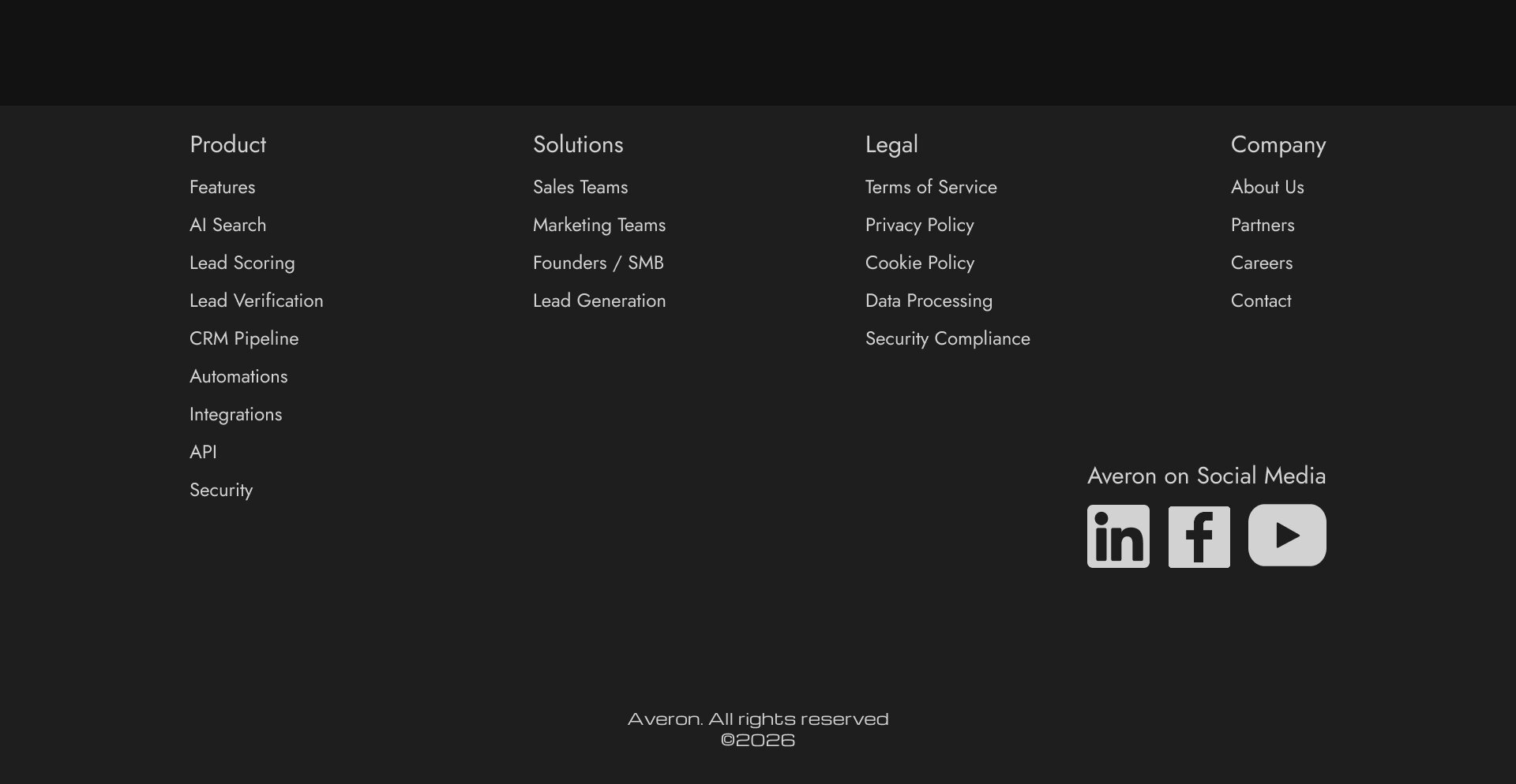
Footer (bottom of the website) contains all useful links, both within the site and to social media.
These sections lead to key product pages and help users quickly find the information they need.
Product — leads to key product pages (features, capabilities, highlights). For those who are already interested and want to explore the product in more depth.
Solutions — covers use cases and task segments. It doesn’t showcase the product itself, but rather the problems it solves in different contexts (by roles, industries, and use cases).
Company — builds trust through information about the company.
It answers the question “who are they and can they be trusted?”
Legal — the legal section that mitigates formal and corporate risks; particularly important for B2B and data-driven products.
Social Media — the brand’s external presence (LinkedIn, Facebook, YouTube), which confirms the company’s legitimacy and provides additional touchpoints beyond the website.
Result:
As a result, we redesigned the website’s structure to cater to warm inbound traffic (advertising, content, referrals).
And adapted the user journey to align with their decision-making processes at every stage of their interaction with the product.
This allowed us to increase the lead conversion rate from 2% to 4% (+100%).
And increase the number of sales inquiries from 22% to 30% (+36%).
Which indicates an increase in the overall effectiveness of the funnel and a rise in high-intent user behavior.
See Full Website