Redesigning the website to expand the market
+150% conversion rate
About
Stratum — an IT services provider.
In this case study, the company sought to expand its positioning and market reach from “Healthcare” to “Critical Niches” such as Financial, Healthcare, and Manufacturing.
We structured the messaging and website architecture with lead sources, the target audience, and the company’s size in mind, maintaining the company’s visual identity.
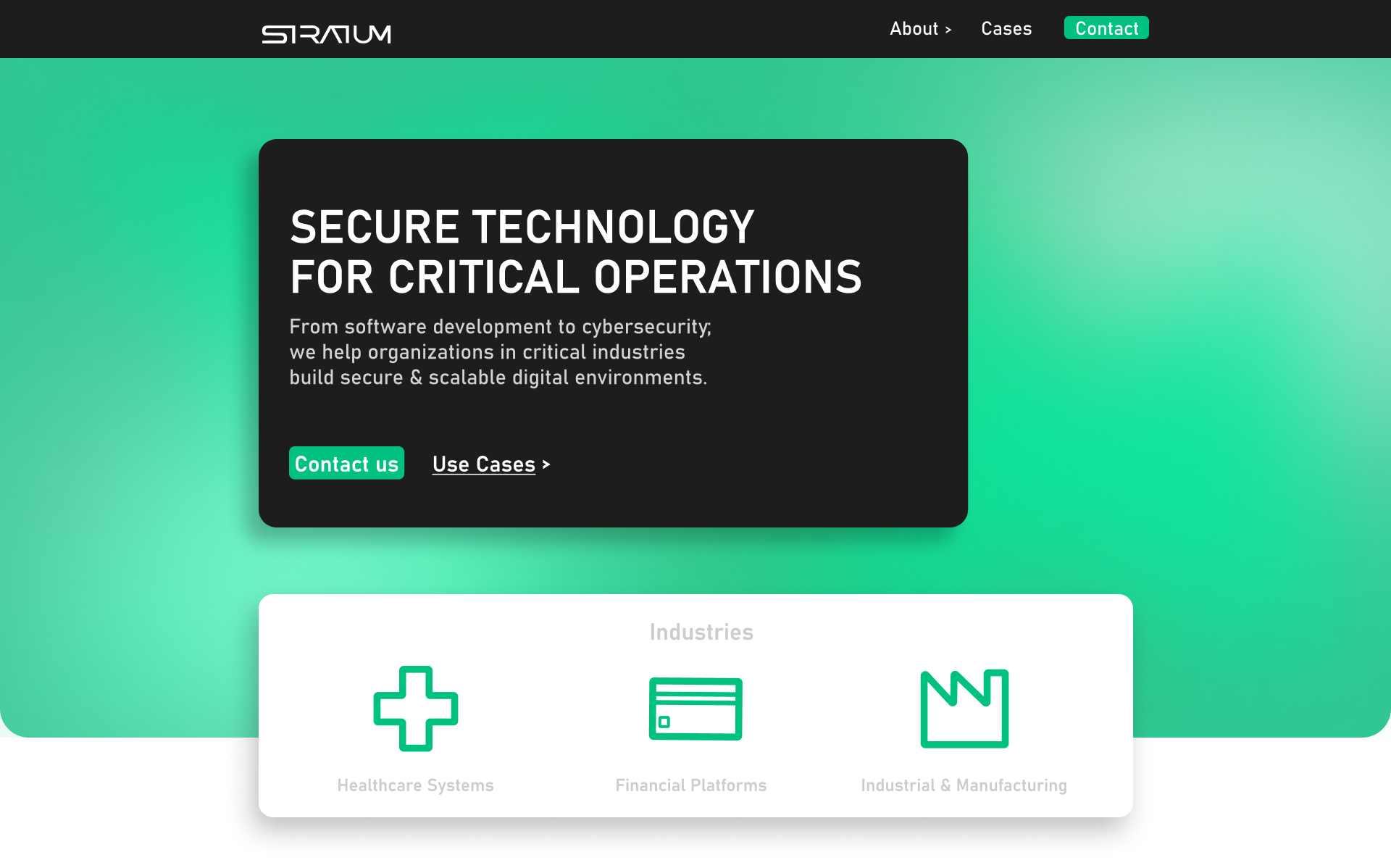
First Screen
The navigation in the header focuses on the key call-to-action “Contact”, which is highlighted in green.
To keep things simple, the “About” section displays several options when you hover over it.
The “Cases” button has been placed separately, given that the company is entering a new market. Cold outreach and sales are the primary lead generation channels, so having case studies is essential.
The headline immediately makes it clear what the company does and who its target audience is.
Words like “secure” immediately address one of the users' key concerns: the security of the technology.
The subheading provides a more detailed description of the company's activities, giving users clarity right from the first screen.
“Industries” immediately narrows the selection down to the industries into which the company has expanded.
For the user, this screen immediately shows that the company works specifically with them and their problem.
This approach is effective in boosting conversion rates.
The CTA (call-to-action) system allows users who are already familiar with the content to quickly find their way around when they return to the site and schedule a call with the company.
For those who are at an earlier stage of the decision-making process but are aware of the problem and want to review the company’s case studies, the “Case Studies” button makes this possible.

First Trust layer
The section featuring “Trusted by” and company logos adds external credibility for cold visitors.
The user sees that others trust you, which reduces their internal risk of choosing you.
In this way, the user is ready to explore the site further.
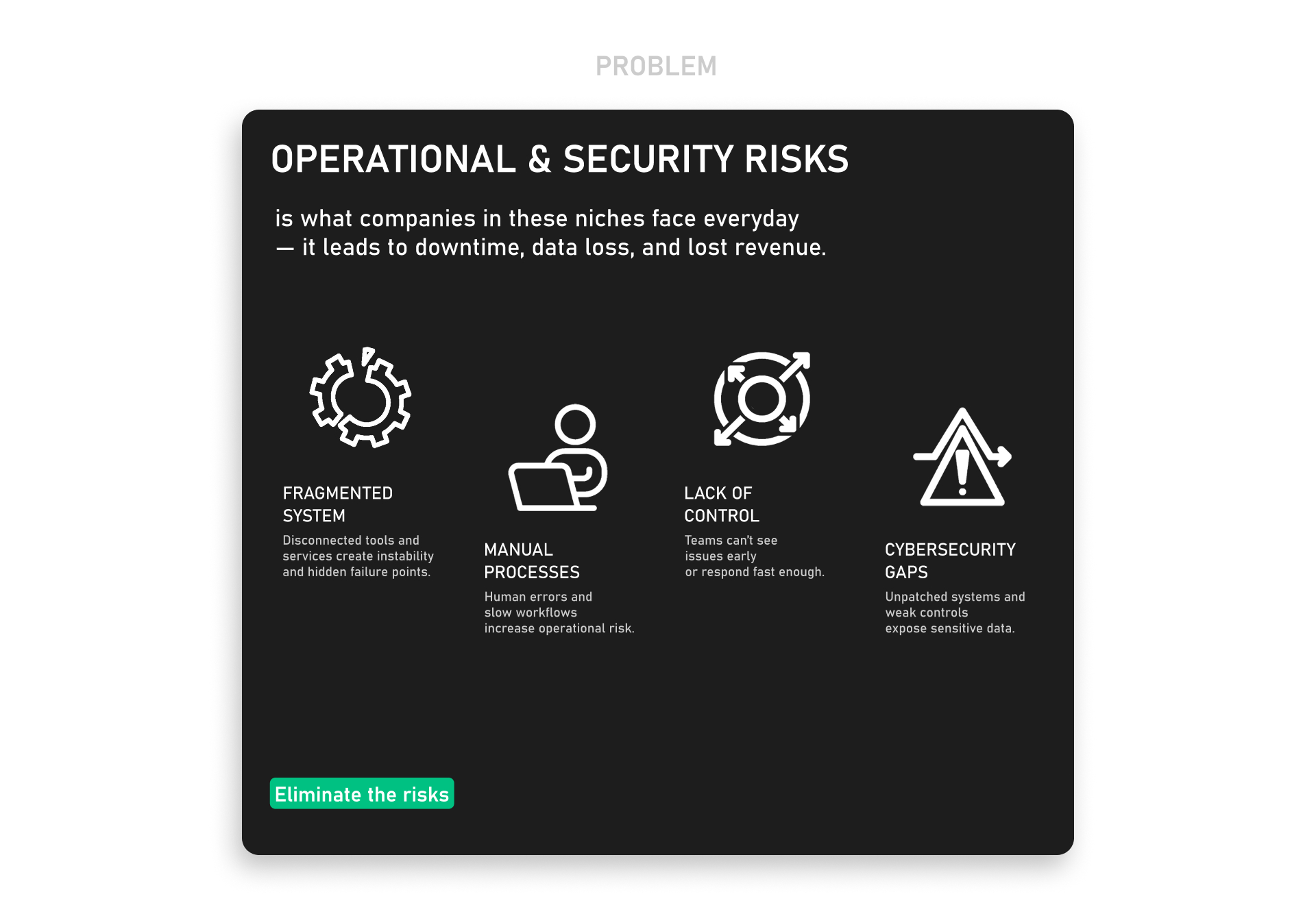
Problem
The purpose of this section is to describe the challenges faced by users in various industries.
The section guides the user through the following process:
Problem -> Causes
This approach creates a clear user journey: from recognizing the problem to gaining insight which builds trust and increases conversion rates.
The block also creates a sense of urgency by using phrases like “daily risks.”
This plays on the user's fears and prevents them from putting off their decision.
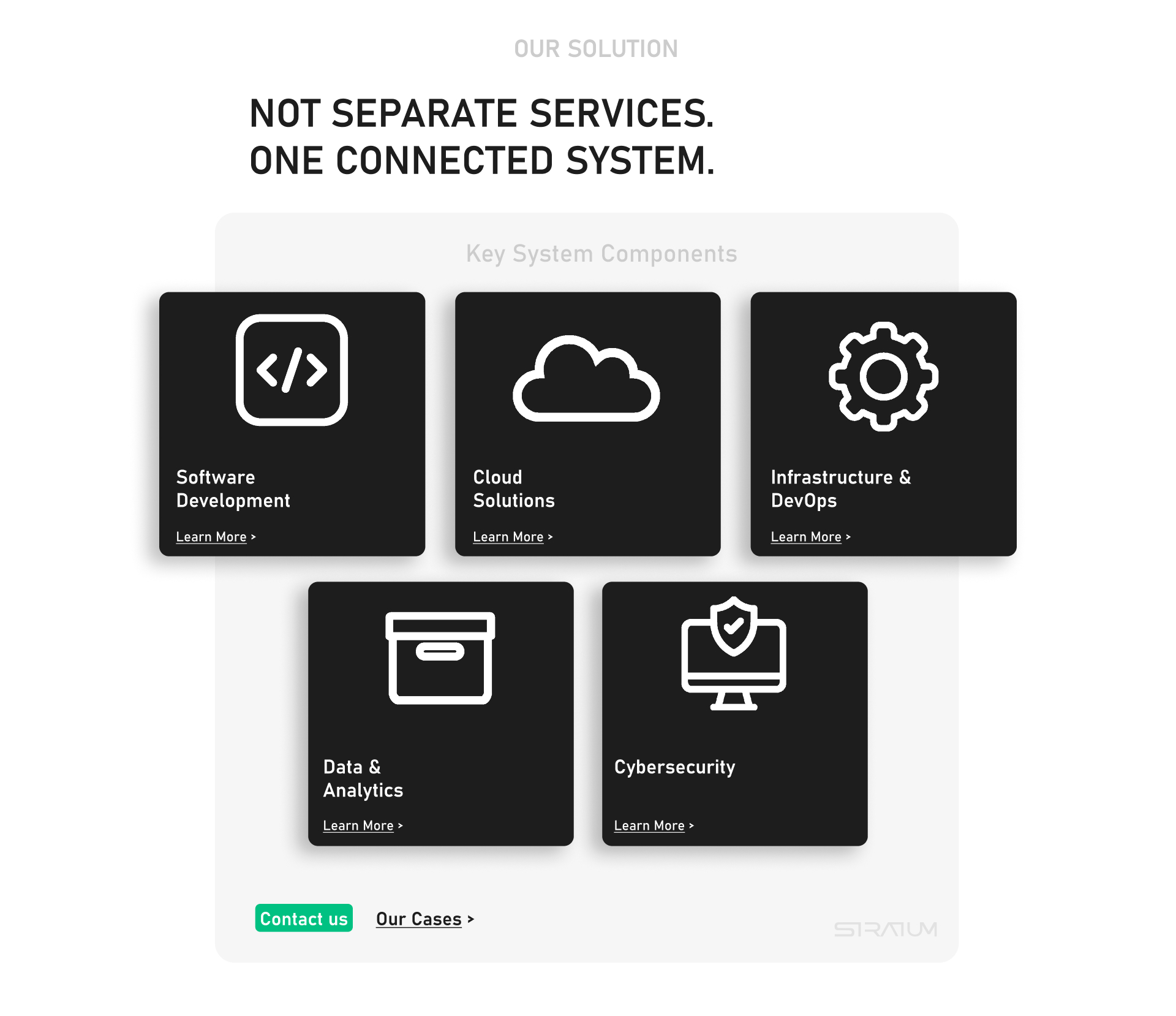
Solution & Services
The solution block does more than just present a catalog. Its core purpose is to move the process forward; after reframing, the user needs not just individual solutions, but a system that actually works.
The catalog itself is presented as system components, rather than individual services.
“Learn more” buttons provide additional clarity for interested audiences. These audiences are generally either more technically savvy — for whom it is important that the company uses technology correctly. Or less technically savvy — who may not understand these points and want to learn more.
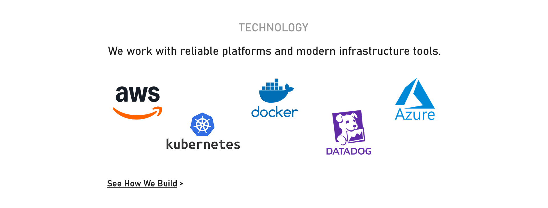
Resolved Concerns
This section is aimed at more tech-savvy users who want to ensure that the company is compatible with their software.
The section is designed to build trust, which ultimately leads to higher conversion rates once trust-related concerns have been addressed.
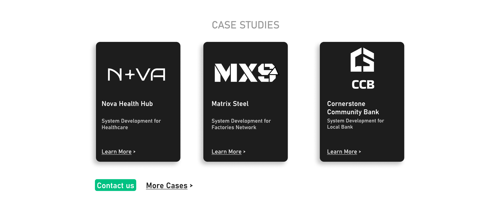
Case Studies
Ultimately, this section maximizes trust before the final steps.
The case studies section comes after the solution, technical details, and process, because by this point the user already has an understanding—but no proof yet. The case studies bridge this gap: they demonstrate that everything described above actually works in practice.
The user sees similar situations, realizes that you’ve already handled such tasks, and overcomes the final hurdle.
The “Contact” button captures this moment of maximum readiness and turns trust into action.
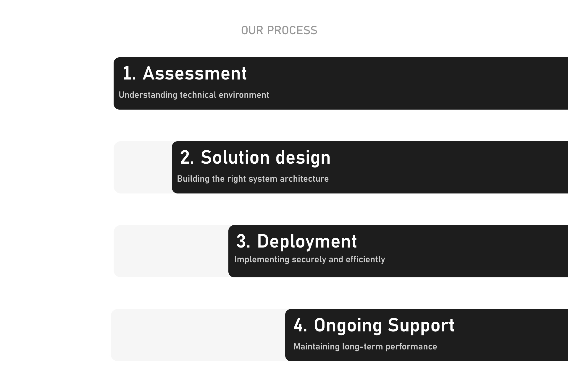
Process Clarity
This section outlines the workflow, from initial contact to the final result.
It breaks down the complex development process into clear stages, reduces the sense of risk, and helps the client understand what happens at every step.
The “Contact Us” button is placed at the end of the process because the user has already understood how company operates and is ready for the next step — contact.
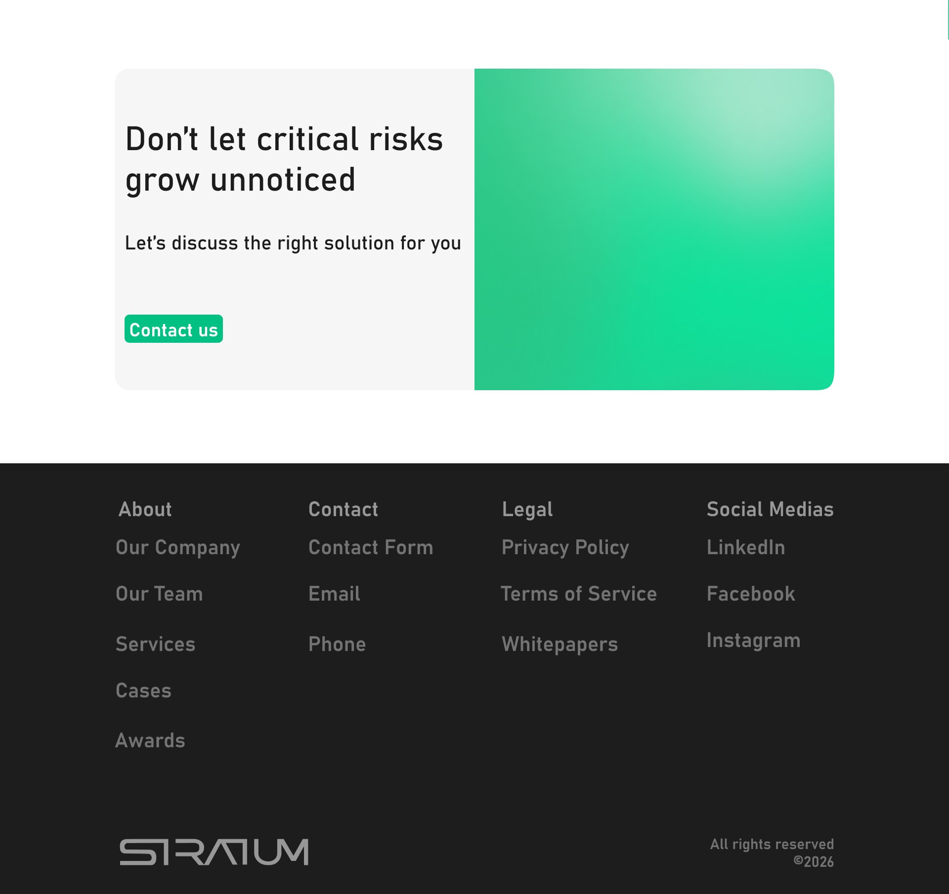
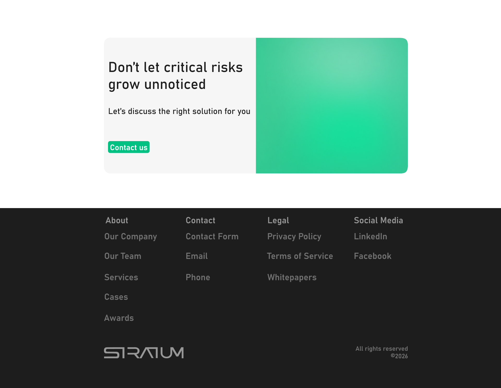
Final CTA & Footer
The section with the final call to action serves as the logical conclusion of the website.
This is because, thanks to a well-structured user journey, the user is ready to make a purchase after browsing the site.
The phrase “Don’t let critical risks go unnoticed” creates a sense of urgency and encourages action, while “Let’s discuss the right solution for you” translates that into a specific next step.
The “Contact us” button captures the moment of maximum readiness and removes unnecessary barriers before the conversation begins.
The bottom section of the website (footer) serves as a trust and navigation zone for different types of users who are looking for specific information or actions.
About / Services / Cases — lead to key content pages that address the various stages of the decision-making process.
Contact (Contact Form, Email, Phone) — entry points for those who are ready to engage.
Legal (Privacy Policy, Terms, Whitepapers) — addresses legal and corporate concerns, which is especially important for banking and healthcare.
Social Media (LinkedIn, Facebook, Instagram) — demonstrates that the company exists beyond the website and can be verified.
Result:
As a result, we redesigned the website’s structure to cater to cold inbound traffic.
And adapted the user journey to align with their role and decision-making processes at every stage of their interaction with the product.
This allowed us to increase the lead conversion rate from 0.8% to 2% (+150%).
See Full Website: